Next Page Previous Page Home Tools & Aids Search Handbook
1. Exploratory Data Analysis
1.3. EDA Techniques
1.3.3. Graphical Techniques: Alphabetic
1.3.3.27. Spectral Plot

1.3.3.27.2.

Spectral Plot: Strong Autocorrelation and Autoregressive Model

Spectral Plot for Random Walk Data spectral plot for random walk data
Conclusions We can make the following conclusions from the above plot of the FLICKER.DAT data set.
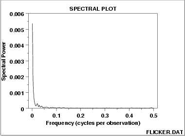
  1. Strong dominant peak near zero.
  2. Peak decays rapidly towards zero.
  3. An autoregressive model is an appropriate model.
Discussion This spectral plot starts with a dominant peak near zero and rapidly decays to zero. This is the spectral plot signature of a process with strong positive autocorrelation. Such processes are highly non-random in that there is high association between an observation and a succeeding observation. In short, if you know Yi you can make a strong guess as to what Yi+1 will be.
Recommended Next Step The next step would be to determine the parameters for the autoregressive model:

    \[ Y_{i} = A_0 + A_1*Y_{i-1} + E_{i} \]

Such estimation can be done by linear regression or by fitting a Box-Jenkins autoregressive (AR) model.

The residual standard deviation for this autoregressive model will be much smaller than the residual standard deviation for the default model

    \[ Y_{i} = A_0 + E_{i} \]

Then the system should be reexamined to find an explanation for the strong autocorrelation. Is it due to the

  1. phenomenon under study; or
  2. drifting in the environment; or
  3. contamination from the data acquisition system (DAS)?
Oftentimes the source of the problem is item (3) above where contamination and carry-over from the data acquisition system result because the DAS does not have time to electronically recover before collecting the next data point. If this is the case, then consider slowing down the sampling rate to re-achieve randomness.
Home Tools & Aids Search Handbook Previous Page Next Page