4.
Process Modeling
4.4.
Data Analysis for Process Modeling
4.4.4.
How can I tell if a model fits my data?
4.4.4.5.
|
How can I test whether or not the random errors are distributed
normally?
|
|
|
Histogram and Normal Probability Plot Used for Normality Checks
|
The histogram and
the normal probability plot
are used to check whether or not it is reasonable to assume that the random errors
inherent in the process have been drawn from a normal distribution. The
normality assumption is needed for
the error rates we are willing to accept when making decisions about the process. If
the random errors are not from a normal distribution, incorrect decisions will be made
more or less frequently than the stated confidence levels for our inferences indicate.
|
|
Normal Probability Plot
|
The normal probability plot is constructed by plotting the sorted values of the residuals
versus the associated theoretical values from the standard normal distribution. Unlike
most residual scatter plots, however, a random scatter of points does not indicate that
the assumption being checked is met in this case. Instead, if the random errors are
normally distributed, the plotted points will lie close to straight line. Distinct
curvature or other signficant deviations from a straight line indicate that the random
errors are probably not normally distributed. A few points that are far off the line
suggest that the data has some outliers in it.
|
|
Examples
|
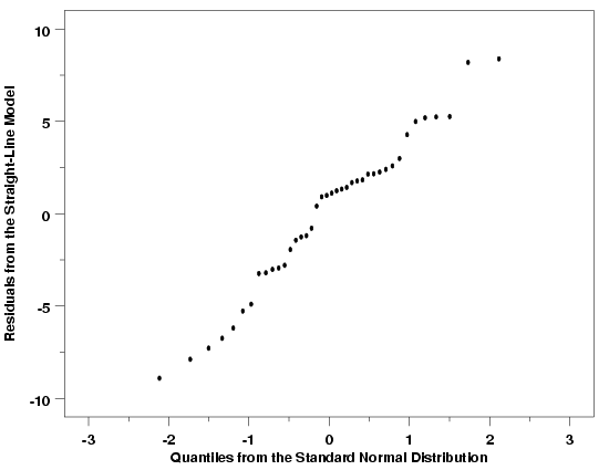
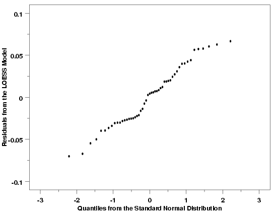
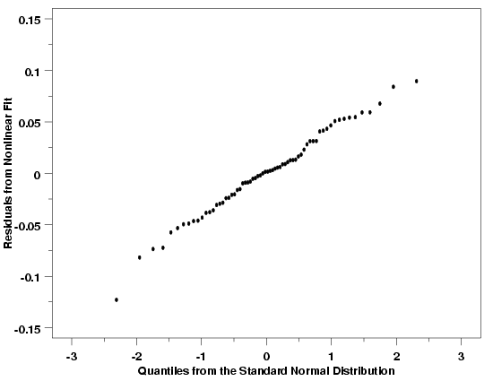
Normal probability plots for
the Pressure/Temperature example,
the Thermocouple Calibration example, and
the Polymer Relaxation example
are shown below. The normal probability plots for these three examples indicate that
that it is reasonable to assume that the random errors for these processes are drawn
from approximately normal distributions. In each case there is a strong linear
relationship between the residuals and the theoretical values from the standard normal
distribution. Of course the plots do show that the relationship is not perfectly
deterministic (and it never will be), but the linear relationship is still clear.
Since none of the points in these plots deviate much from the linear relationship
defined by the residuals, it is also reasonable to conclude that there are no
outliers in any of these data sets.
|
|
Normal Probability Plot: Temperature / Pressure Example
|

|
|
Normal Probability Plot: Thermocouple Calibration Example
|

|
|
Normal Probability Plot: Polymer Relaxation Example
|

|
|
Further Discussion and Examples
|
If the random errors from one of these processes were not normally distributed, then
significant curvature may have been visible in the relationship between the residuals
and the quantiles from the standard normal distribution, or there would be residuals
at the upper and/or lower ends of the line that clearly did not fit the linear
relationship followed by the bulk of the data. Examples of some typical cases obtained
with non-normal random errors are illustrated in the
general discussion of the normal probability
plot.
|
|
Histogram
|
The normal probability plot helps us determine whether or not it is reasonable to assume
that the random errors in a statistical process can be assumed to be drawn
from a normal distribution. An advantage of the normal probability plot is that the
human eye is very sensitive to deviations from a straight line that might indicate
that the errors come from a non-normal distribution. However, when the normal
probability plot suggests that the normality assumption may not be reasonable, it does
not give us a very good idea what the distribution does look like. A histogram of the
residuals from the fit, on the other hand, can provide a clearer picture of the shape
of the distribution. The fact that the histogram provides more general distributional
information than does the normal probability plot suggests that it will be harder to
discern deviations from normality than with the more specifically-oriented normal
probability plot.
|
|
Examples
|
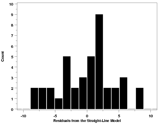
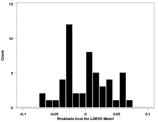
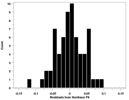
Histograms for the three examples used to illustrate the normal probability plot
are shown below. The histograms are all more-or-less bell-shaped, confirming the
conclusions from the normal probability plots. Additional examples can be found
in the gallery of graphical techniques.
|
|
Histogram: Temperature / Pressure Example
|

|
|
Histogram: Thermocouple Calibration Example
|

|
|
Histogram: Polymer Relaxation Example
|

|
|
Important Note
|
One important detail to note about the normal probability plot and the
histogram is that they provide information on the distribution of the random
errors from the process only if
- the functional part of the model is correctly specified,
- the standard deviation is constant across the data,
- there is no drift in the process, and
- the random errors are independent from one run to the next.
If the other residual plots indicate problems with the model, the
normal probability plot and histogram will not be easily interpretable.
|
