
4.6. Case Studies in Process Modeling
4.6.2. Alaska Pipeline
4.6.2.2. |
Check for Batch Effect |
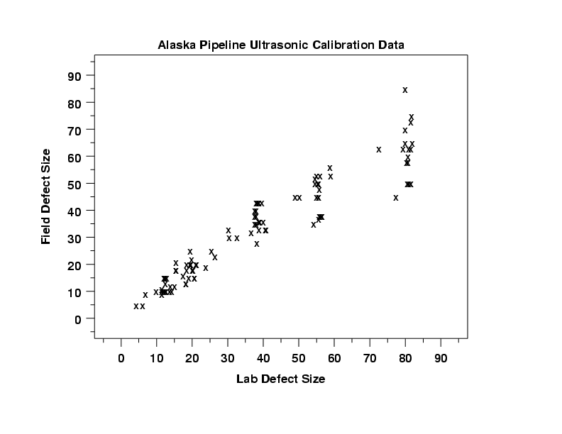
This scatter plot shows that a straight line fit is a good initial candidate model for these data.
In this case, the scientist was not inherently interested in the batch. That is, batch is a nuisance factor and, if reasonable, we would like to analyze the data as if it came from a single batch. However, we need to know that this is, in fact, a reasonable assumption to make.

This conditional plot shows a scatter plot for each of the six batches on a single page. Each of these plots shows a similar pattern.
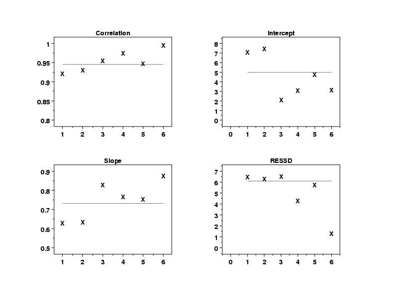
The linear correlation plot (upper left), which shows the correlation between field and lab defect sizes versus the batch, indicates that batch six has a somewhat stronger linear relationship between the measurements than the other batches do. This is also reflected in the significantly lower residual standard deviation for batch six shown in the residual standard deviation plot (lower right), which shows the residual standard deviation versus batch. The slopes all lie within a range of 0.6 to 0.9 in the linear slope plot (lower left) and the intercepts all lie between 2 and 8 in the linear intercept plot (upper right).
These two plots provide a good pair. The plot of the fit statistics allows quick and convenient comparisons of the overall fits. However, the conditional plot can reveal details that may be hidden in the summary plots. For example, we can more readily determine the existence of clusters of points and outliers, curvature in the data, and other similar features.
Based on these plots we will ignore the batch variable for the remaining analysis.
