
5.5. Advanced topics
5.5.9. An EDA approach to experimental design
5.5.9.2. |
DOE scatter plot |
- What are the most important factors?
- What is the best setting for each of these important factors?
- What data points are outliers?
A factor can be "important" if it leads to a significant shift in either the location or the variation of the response variable as we go from the "-" setting to the "+" setting of the factor. Both definitions are relevant and acceptable. The default definition of "important" in engineering/scientific applications is a shift in location. Unless specified otherwise, when a factor is claimed to be important, the implication is that the factor caused a large location shift in the response.
A factor setting is "best" if it results in a typical response that is closest, in location, to the desired project goal (maximization, minimization, target). This desired project goal is an engineering, not a statistical, question, and so the desired optimization goal must be specified by the engineer.
A data point is an "outlier" if it comes from a different probability distribution or from a different deterministic model than the remainder of the data. A single outlier in a data set can affect all effect estimates and so in turn can potentially invalidate the factor rankings in terms of importance.
Given the above definitions, the DOE scatter plot is a useful early-step tool for determining the important factors, best settings, and outliers. An alternate name for the DOE scatter plot is "main effects plot".
- Primary: Identification of the important factors.
- Secondary: Best setting for these factors and identification of outliers.
- Vertical Axis: The response (= the raw data) for a given
setting (- or +) of a factor for each of the k
factors.
- Horizontal Axis: The k factors, and the two settings (- and +) within each factor.
From such a foundational plot, the analyst invariably extracts information dealing with location shifts, variation shifts, and outliers. Such information may easily be washed out by other "more advanced" quantitative or graphical procedures (even computing and plotting means!). Hence there is motivation for the DOE scatter plot.
If we were interested in assessing the importance of a single factor, and since "important" by default means shift in location, then the simple scatter plot is an ideal tool. A large shift (with little data overlap) in the body of the data from the "-" setting to the "+" setting of a given factor would imply that the factor is important. A small shift (with much overlap) would imply the factor is not important.
The DOE scatter plot is actually a sequence of k such scatter plots with one scatter plot for each factor.
- Most Important Factors;
- Best Settings of the Most Important Factors;
- Outliers.
Most Important Factors:
For each of the k factors, as we go from the "-" setting to the "+" setting within the factor, is there a location shift in the body of the data? If yes, then
- Which factor has the biggest such data location shift (that
is, has least data overlap)? This defines the "most
important factor".
- Which factor has the next biggest shift (that is, has next
least data overlap)? This defines the "second most important
factor".
- Continue for the remaining factors.
Best Settings for the Most Important Factors:
For each of the most important factors, which setting ("-" or "+") yields the "best" response?
In order to answer this question, the engineer must first define "best". This is done with respect to the overall project goal in conjunction with the specific response variable under study. For some experiments (e.g., maximizing the speed of a chip), "best" means we are trying to maximize the response (speed). For other experiments (e.g., semiconductor chip scrap), "best" means we are trying to minimize the response (scrap). For yet other experiments (e.g., designing a resistor) "best" means we are trying to hit a specific target (the specified resistance). Thus the definition of "best" is an engineering precursor to the determination of best settings.
Suppose the analyst is attempting to maximize the response. In such a case, the analyst would proceed as follows:
- For factor 1, for what setting (- or +) is the body of the data higher?
- For factor 2, for what setting (- or +) is the body of the data higher?
- Continue for the remaining factors.
-
(x1best, x2best, ..., xkbest)
As indicated earlier, the DOE scatter plot will typically be able to estimate best settings for only the first few important factors. Again, the degree of data overlap precludes ascertaining best settings for the remaining factors. Other tools, such as the DOE mean plot, will do a better job of determining such settings.
Outliers:
Do any data points stand apart from the bulk of the data? If so, then such values are candidates for further investigation as outliers. For multiple outliers, it is of interest to note if all such anomalous data cluster at the same setting for any of the various factors. If so, then such settings become candidates for avoidance or inclusion, depending on the nature (bad or good), of the outliers.
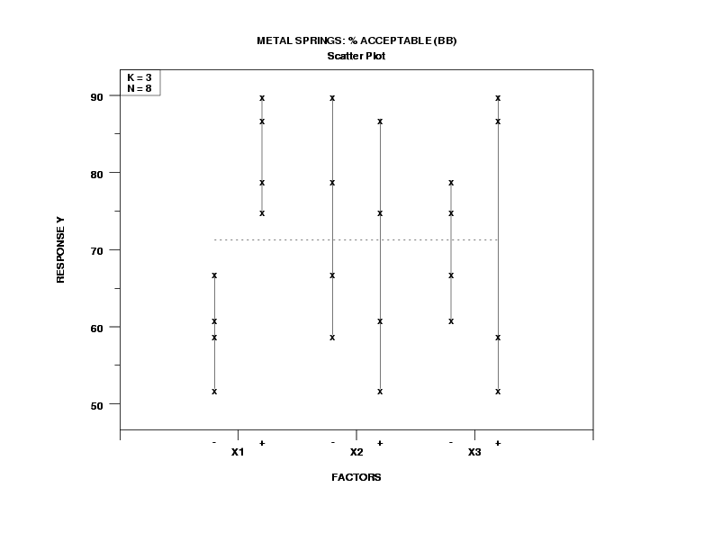
- Most Important Factors:
- X1 (most important);
- X2 (of lesser importance);
- X3 (of least importance).
that is,
- factor 1 definitely looks important;
- factor 2 is a distant second;
- factor 3 has too much overlap to be important with respect to location, but is flagged for further investigation due to potential differences in variation.
- Best Settings:
-
(X1, X2, X3) = (+, -, -) = (+1, -1, -1)
- Outliers: None detected.
