
5.6. Case Studies
5.6.1. Eddy Current Probe Sensitivity Case Study
5.6.1.2. |
Initial Plots/Main Effects |
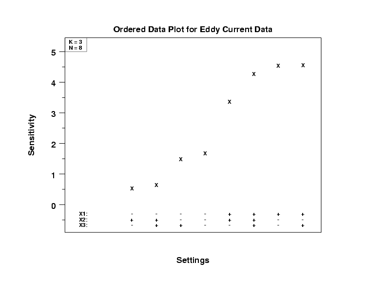
- Important Factors: The four highest response values have
X1 = + while the four lowest response values have
X1 = -. This implies X1 is the most important
factor. When X1 = -, the - values of X2 are
higher than the + values of X2. Similarly, when
X1 = +, the - values of X2 are higher
than the + values of X2. This implies X2 is
important, but less so than X1. There is no clear
pattern for X3.
- Best Settings: In this experiment, we are using the device as a detector, and so high sensitivities are desirable. Given this, our first pass at best settings yields (X1 = +1, X2 = -1, X3 = either).
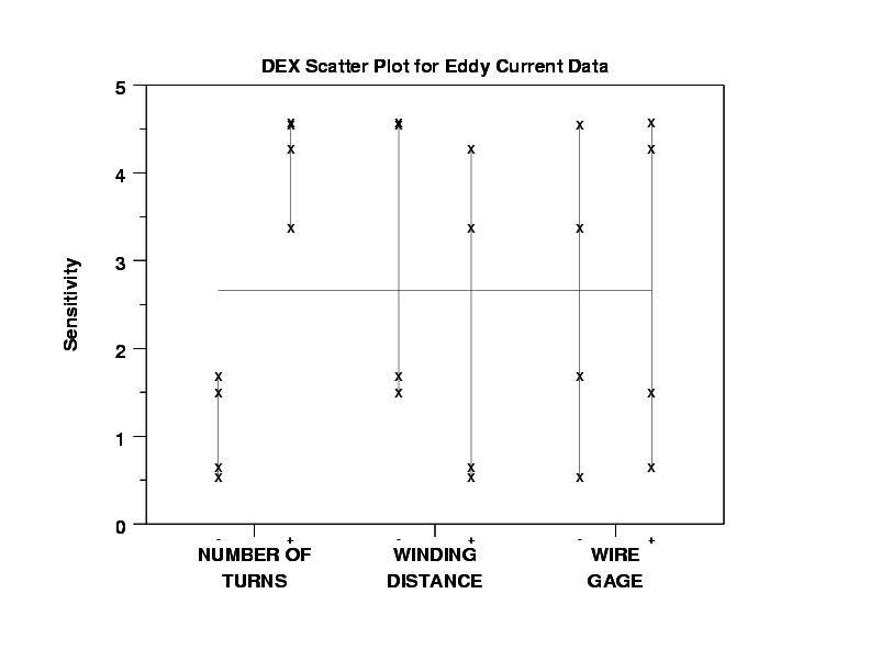
- Important Factors: X1 (Number of Turns) is clearly
important. When X1 = -1, all four senstivities are low, and
when X1 = +1, all four sensitivities are high. X2
(Winding Distance) is less important. The four sensitivities for
X2 = -1 are slightly higher, as a group, than the four
sensitivities for X2 = +1. X3 (Wire Gauge) does
not appear to be important at all. The sensitivity is about the
same (on the average) regardless of the settings for X3.
- Best Settings: In this experiment, we are using
the device as a detector, so high sensitivities are
desirable. Given this, our first pass at best settings
yields (X1 = +1, X2 = -1, X3 = either).
- There does not appear to be any significant outliers.
The DOE mean plot shows the main effects. This provides probably the easiest to interpret indication of the important factors.
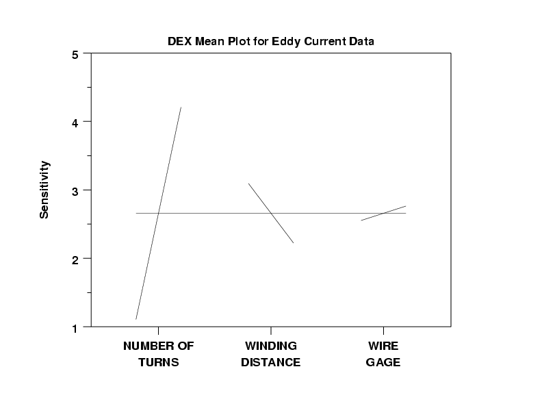
We can make the following conclusions from the DOE mean plot.
- Important Factors:
X1 (effect = large: about 3 ohms)
X2 (effect = moderate: about -1 ohm)
X3 (effect = small: about 1/4 ohm)
- Best Settings: As before, choose the factor settings
that (on the average) maximize the sensitivity:
-
(X1,X2,X3) = (+,-,+)
