|
|
|
| |
Dataplot: Bars |
|
| Introduction | Dataplot can draw a curve as a character or plot symbol at each point, as a connected line, as a spike from the point to a base, as a bar from the point to a base, or as any combination of the above (including drawing none or all of them). The choice is determined by the LINE, CHARACTER, SPIKE, and BAR commands. The switches for these commands work independently of each other. |
| Description |
The BAR switch is most commonly used to generate bar charts. It is
also used to plot histograms (although Dataplot handles this
automatically). The following types of bar charts are commonly
used in business and presentation graphics:
|
| Use of Short Forms |
The short designations (e.g., BL for BLANK, SO for SOLID, DA3 for
DASH3) allow for the specification of a large number of bar types on a
single command line, as in
|
| How Dataplot Decides Which Bar Pattern to Use |
For single-trace plots, as from
For multi-trace plots, as from
PLOT Y X TAG |
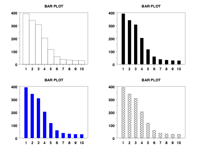
| Dataplot Program Demonstrating the Attributes of Lines |
Dataplot allows you to set various attributes for both the bar
border (color, line style, thickness) and the bar interior
(solid fill, hatch fill pattern, color, various others). The
attributes for the border and the interior are set independently.
The following example shows a few of these attributes.
. TITLE BAR PLOT XLIMITS 1 10 XTIC OFFSET 1 1 LET N = SIZE Y BAR ON LINE BLANK . MULTIPLOT 2 2 MULTIPLOT CORNER COORDINATES 0 0 100 100 PLOT Y . BAR FILL ON BAR WIDTH 0.5 PLOT Y . BAR FILL COLOR BLUE BAR BORDER COLOR BLUE PLOT Y . BAR BORDER COLOR BLACK BAR PATTERN D1D2 BAR PATTERN SPACING 3 PLOT Y END OF MULTIPLOT |
| Dataplot Graph |
The above Dataplot program generated the following graph.
|
|
Date created: 06/05/2001
|
|