SED navigation bar go to SED home page go to Dataplot home page go to NIST home page SED Home Page SED Staff SED Projects SED Products and Publications Search SED Pages
Dataplot Vol 1 Vol 2

PIE CHART

Name:
    PIE CHART
Type:
    Graphics Command
Purpose:
    Generates a pie chart.
Description:
    A pie chart is a graphical data analysis technique for summarizing the distributional information of a variable. It is a circular plot consisting of wedges where the size of each wedge is proportional to the frequency (= number of observations) in that wedge. The plot is to be read clockwise (where the first wedge is at "9 o'clock).

    If a single variable is specified, Dataplot divides the values into frequency classes in the same manner as for a histogram. The histogram and the pie chart have the same information except the histogram has bars at the data values (where the height of the bar is proportional to the number of observations in the class), whereas the pie chart has wedges (where the area of the wedge is proportional to the number of observations in the class).

    If two variables are specified, the first variable contains pre-computed frequencies and the second variable is a group identifier. This second form is more commonly used.

    As mentioned above, by default raw data is first binned into frequency data. However, in many if not most cases, the response variable is intended to be interpreted as a frequency (i.e., the proportion for Y(i) is Y(i)/SUM[Y(i)]). That is, we have an implicit group-id variable that is simply 1, 2, ..., N where N is the number of points in the response variable.

    To suppress this binning for the single variable case, enter

      SET PIE CHART UNBINNED

    To restore the default of binning raw data, enter

      SET PIE CHART BINNED

    Typically no binning is preferred for small size data sets. Binning can be helpful for larger data sets in that it reduces the number of pie wedges that are plotted (in this case, we are really treating a pie chart as an alternative way to graph a histogram).

Syntax 1:
    PIE CHART <x>             <SUBSET/EXCEPT/FOR qualification>
    where <x> is the variable of raw data values;
    and where the <SUBSET/EXCEPT/FOR qualification> is optional.

    This syntax is used for the case where you have raw data.

Syntax 2:
    PIE CHART <y> <x>             <SUBSET/EXCEPT/FOR qualification>
    where <y> is the variable of pre-computed frequencies;
                <x> is the variable of group identifiers;
    and where the <SUBSET/EXCEPT/FOR qualification> is optional.

    This syntax is used for the case where you have pre-computed frequencies at each data level. This assumes that you have equal width bins.

Syntax 3:
    PIE CHART <y> <xlow> <xhigh>             <SUBSET/EXCEPT/FOR qualification>
    where <y> is the variable of pre-computed frequencies;
                <xlow> is the variable containing the lower limits of the bins;
                <xhigh> is the variable containing the upper limits of the bins;
    and where the <SUBSET/EXCEPT/FOR qualification> is optional.

    This syntax is used for the case where you have pre-computed frequencies at each data level. This syntax is used when you have unequal width bins.

Examples:
    PIE CHART X
    PIE CHART TEMP SUBSET TEMP > 0
    PIE CHART F X SUBSET X > 2
    PIE CHART COUNTS STATE
Note:
    Each wedge is drawn with a common set of attributes. The attributes of the wedge borders are set with the LINE, LINE COLOR, and LINE THICKNESS commands (typically they are all set the same). The attributes of the interior are set with the various REGION commands. Any labels for the wedges must be set with the LEGEND or TEXT commands. The CROSS HAIR command can help in positioning labels. The program example below shows how to set the attributes. Dataplot does not support features such as 3d pie charts or exploding slices that are common in many business graphics programs.
Note:
    Although pie charts are popular in business graphics, they are generally a poor graphics technique. See the book listed in the Reference section below for more information.
Note:
    For the one variable form of the command, Dataplot uses a class width of 0.3 X the standard deviation of the variable. Use the CLASS WIDTH to override this default. Dataplot also tends to generate a large number of zero frequency classes at the lower and upper tails. The CLASS LOWER and CLASS UPPER commands can be used to set lower and upper limits for the classes.
Default:
    None
Synonyms:
    None
Related Commands:
    HISTOGRAM = Generates a histogram.
    FREQUENCY PLOT = Generate a frequency plot.
    PLOT = Generate a data or function plot.
    CLASS LOWER = Set the lower class minimum for histograms, frequency plots, and pie charts.
    CLASS UPPER = Set the upper class maximum for histograms, frequency plots, and pie charts.
    CLASS WIDTH = Set the class width for histograms, frequency plots, and pie charts.
    LINE = Sets the types for plot lines.
    LINE COLOR = Sets the colors for plot lines.
    LINE THICKNESS = Sets the thicknesses for plot lines.
    REGION FILL = Sets on/off switches for region fills.
Reference:
    William Cleveland (1985), "The Elements of Graphing Data", Wadsworth, p. 264.
Applications:
    Business Graphics
Implementation Date:
    Pre-1987
    1993/11: Added the ability to set the attributes of the pie wedges.
Program:
     
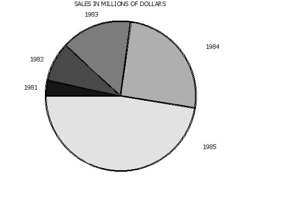
    LET X = DATA 81 82 83 84 85
    LET Y = DATA 2 5 9 15 28
    .
    TITLE SALES IN MILLIONS OF DOLLARS
    LINE THICKNESS .3 ALL
    REGION FILL ON ALL
    REGION PATTERN COLOR G10 G30 G50 G70 G90
    REGION FILL COLOR G10 G30 G50 G70 G90
    LET N = SIZE X
    LOOP FOR K = 1 1 N
        LET A = X(K)
        LEGEND ^K 19^A
    END OF LOOP
    LEGEND 1 COORDINATES 8 58
    LEGEND 2 COORDINATES 10 71
    LEGEND 3 COORDINATES 28 92
    LEGEND 4 COORDINATES 68 77
    LEGEND 5 COORDINATES 67 30
    PIE CHART Y X
        
    plot generated by sample program
Date created: 06/10/2016
Last updated: 12/04/2023

Please email comments on this WWW page to alan.heckert@nist.gov.