POISSON PLOT
Name:
Type:
Purpose:
Generates one of the following types of plots:
- a Poisson plot
- a geometric plot
- a negative binomial plot
- a binomial plot
- a logarithmic series plot
Description:
These plots are used to determine if the specified
distribution provides an appropriate distributiuonal
model to a set of data. These are similar in concept
to probability plots in that we generate a plot that
should appear linear if the data are in fact fit well
by the distribution.
The following table shows how these plots are constructed
where x and nx denote the class value
and the corresponding frequency. In all cases, the x-coordinate
is x.
|
Distribution
|
\( \phi (n_{x}^{*}) \)
Y-Axis
Coordinate
|
Theoretical
Slope
|
Theoretical
Intercept
|
|
|
Poisson
|
\( \log \left( \frac{x!n_{x}^{*}}{N} \right) \)
|
\( \log(\lambda) \)
|
\( -\lambda \)
|
|
Geometric
|
\( \log \left( \frac{n_{x}^{*}}{N} \right) \)
|
log(1-p)
|
log(p)
|
|
Negative Binomial
|
\(
\log ( \frac{n_{x}^{*}}
{N
\left(
\begin{array}{c}
n+x-1 \\ x
\end{array}
\right)
} )
\)
|
log(1-p)
|
n log(p)
|
|
Binomial
|
\(
\log ( \frac{n_{x}^{*}}
{N
\left(
\begin{array}{c}
n \\ x
\end{array}
\right)
} )
\)
|
log(p/(1-p))
|
n log(1-p)
|
|
Logarithmic Series
|
\( \log \left( \frac{x n_{x}^{*}}{N} \right) \)
|
\( \log(\theta) \)
|
\( -\log(-\log(1 - \theta)) \)
|
where
|
p
|
=
|
probability of success parameter for the
geometric, binomial, and negative binomial
distributions.
|
|
\( \theta \)
|
=
|
the shape parameter for the logarithmic series
distribution.
|
|
n
|
=
|
the number of trials parameter for the binomial
distribution.
|
The theoretical slope parameter can be used to estimate
the shape parameter of the distribution.
Hoaglin and Tukey (see References below) provides the
derivations of why these plots should be linear if the specified
distribution is appropriate. They also make the following
suggestions for enhancing these plots:
- A 95% confidence interval for each point on the plot
is given as
\( \phi (n_{x}^{*}) \pm h(x) \)
where
|
\( n_{x}^{*} \)
|
=
|
nx - 0.8 nx/N
- 0.67
|
nx ≥ 2
|
|
|
=
|
1/e
|
nx = 1
|
|
|
=
|
undefined
|
nx = 0
|
|
h(x)
|
=
|
\(
\frac{1.96 \sqrt{1 - \hat{p_{x}}}}
{\sqrt{n_{x} - (0.25 \hat{p_{x}} + 0.47) \sqrt{n_{x}}}}
\)
|
|
|
N
|
=
|
total sample size
|
|
|
\( \hat{p_{x}} \)
|
=
|
\( \frac{n_{x}} {N} \)
|
|
The rationale for this confidence interval is given in
the Hoaglin and Tukey reference.
The
\( n_{x}^{*} \) values are referred to as the adjusted
frequencies.
- These plots can be "leveled". By leveling, we convert
the plot from interpretation of departures from a
diagonal line to departures from a horizontal line.
This may be an easier visual task.
To level the plot, we plot
\( \phi^{'} (n_{x}) \)
=
\( \phi (n_{x}) \)
- (intercept + slope*x)
where intercept and slope are taken from the columns
"theoretical intercept" and "theoretical slope" in the
table above.
Note that a preliminary estimate of the shape parameter
for the distribution is required to compute the
theoretical intercept and the theoretical slope.
This is discussed further in a Note section below.
Syntax 1:
<dist> PLOT <y>
<SUBSET/EXCEPT/FOR qualification>
where <y> is a response variable;
<dist> is one of the following:
POISSON
GEOMETRIC
NEGATIVE BINOMIAL
BINOMIAL
LOGARITHMIC SERIES;
and where the <SUBSET/EXCEPT/FOR qualification> is optional.
This syntax is used for the case where you have raw data.
Dataplot will automatically create the frequency table.
Syntax 2:
Examples:
POISSON PLOT Y
POISSON PLOT Y X
GEOMETRIC PLOT Y
GEOMETRIC PLOT Y X
Note:
For the leveled version of the plot, a preliminary estimate
of the shape parameter(s) is required.
- For the Poisson distribution, the maximum likelihood estimate
of \( \lambda \) is the sample mean. This is used as the
prelimanary estimate of \( \lambda \) in the leveled version
of the plot.
- For the binomial distribution, you need to specify
the n parameter (the number of trials) by entering
the following command before the BINOMIAL PLOT
command:
The sample mean is then used as the estimate of the
p (probability of success) parameter. This is
the maximum likelihood estimate.
- For the geometric distribution, the maximum likelihood
estimate of the p (probability of success) parameter
is
\( \frac{1} {\bar{x} + 1} \)
where
\( \bar{x} \) is the sample mean.
- For the negative binomial distribution, there are two
parameters: p and k. For this plot, k
is restricted to integer values.
You can either specify a value for k by entering
the command
LET K = <value>
or you can let Dataplot estimate the value.
If k is not specified, the moment estimate of
k is used:
\( \hat{k} = \frac{\hat{x}^2}{s^2 - \bar{x}} \)
This estimate will be rounded to the nearest integer.
The maximum likelihood estimate of p is then
\( \hat{p} = \frac{k} {\bar{x} + k} \)
If k ≥ 2, then the bias corrected estimate is used
\( \hat{p} = \frac{k-1} {\bar{x} + k - 1} \)
- For the logarithmic series distribution, you can
specify the desired value of theta by entering the
command
You can obtain this estimate either by using
maximum likelihood, the PPCC plot, or the KS plot.
Note:
The appearance of the plot can be controlled with
the LINE and CHARACTER commands. Specifically,
|
trace 1
|
=
|
\( \phi(n_x) \)
versus x
|
|
trace 2
|
=
|
fitted line for
\( \phi(n_x) \)
versus x
|
|
trace 3
|
=
|
\( \phi (n_{x}^{*}) \)
versus x
|
|
trace 4
|
=
|
fitted line for
\( \phi (n_{x}^{*}) \)
versus x
|
|
trace 5
|
=
|
lower confidence point
|
|
trace 6
|
=
|
upper confidence point
|
|
trace 7 and above
|
=
|
line connecting the lower and upper confidence points
|
If you want to suppress any of these components, you can
set both the CHARACTER and LINE settings to BLANK. The
example programs below demonstrate the use of the LINE
and CHARACTER commands to control the appearance of the plot.
Note:
By default, the unleveled plot is generated. To generate
the leveled plot, enter the command
SET POISSON PLOT LEVEL ON
To reset the default, enter the command
SET POISSON PLOT LEVEL OFF
This command applies to all five of the plots described here,
not just the Poisson plot.
Note:
The following internal parameters are saved by this plot:
All plots:
|
PPA0
|
=
|
the intercept of the fitted line (unadjusted frequencies)
|
|
PPA1
|
=
|
the slope of the fitted line (unadjusted frequencies)
|
|
PPA0ADJU
|
=
|
the intercept of the fitted line (adjusted frequencies)
|
|
PPA1
|
=
|
the slope of the fitted line (adjusted frequencies)
|
Poisson plot:
|
LAMBDAPP
|
=
|
the estimate of \( \lambda \)
based on the unadjusted frequencies
|
|
LAMBDAPA
|
=
|
the estimate of \( \lambda \)
based on the adjusted frequencies
|
Binomial, negative binomial, geometric plot:
|
PPP
|
=
|
the estimate of p based on the unadjusted
frequencies
|
|
PPPADJ
|
=
|
the estimate of p based on the adjusted frequencies
|
Logarithmic series plot:
|
THETAPP
|
=
|
the estimate of \( \theta \)
based on the unadjusted frequencies
|
|
THETAPPA
|
=
|
the estimate of \( \theta \)
based on the adjusted frequencies
|
Default:
The unleveled version of the plot is generated by default.
Synonyms:
Related Commands:
References:
Hoaglin (1980), "A Poissonness Plot", The American
Statistician, 34, pp. 146-149.
Hoaglin and Tukey (1985), "Checking The Shape of Discrete
Distributions". In Hoaglin, Mosteller, and Tukey, editors,
"Exploring Data Tables, Trends, and Shapes", chapter 9,
John Wiley and Sons, New York.
Friendly (2000), "Visualizing Categorical Data", SAS
Publishing, Cary, NC, pp. 49-56.
Applications:
Implementation Date:
Program:
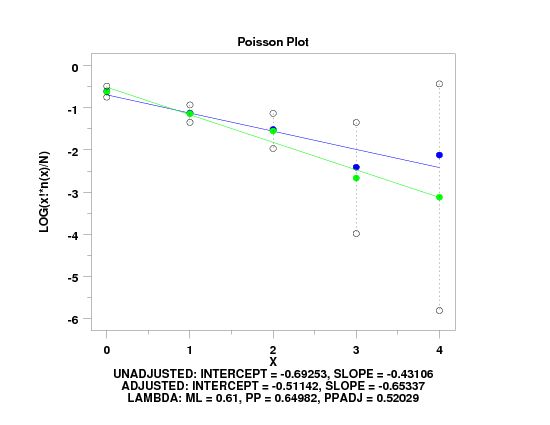
.  Following data from p. 51 of Friendly
read x y
0  109
1   65
2   22
3    3
4    1
end of data
.
title case asis
title offset 2
label case asis
x1label displacement 6
title Poisson Plot
x1label X
y1label LOG(x!*n(x)/N)
x3label
.
char blank all
char fill off all
char hw 1.5 1.2 all
char color black all
char circle blank circle blank circle circle
char fill on off on
char color blue black green
line dotted all
line blank solid blank solid blank blank
line color black blue black green
tic offset units screen
tic offset 3 3
.
poisson plot y x
.
let lambml = weighted mean x y
justification center
move 50 8
text Unadjusted: Intercept = ^ppa0, Slope = ^ppa1
move 50 5
text Adjusted: Intercept = ^ppa0adju, Slope = ^ppa1adju
move 50 2
text Lambda: ML = ^lambml, PP = ^lambdapp, PPadj = ^lambdapa
Date created: 07/25/2007
Last updated: 12/04/2023
Please email comments on this WWW page to
alan.heckert@nist.gov.
|
|

