1.
Exploratory Data Analysis
1.1.
EDA Introduction
1.1.6.
|
An EDA/Graphics Example
|
|
|
Anscombe Example
|
A simple, classic (Anscombe)
example of the central role that graphics play in terms of providing
insight into a data set starts with the
following data set:
|
|
Data
|
  X              Y
10.00           8.04
 8.00           6.95
13.00           7.58
 9.00           8.81
11.00           8.33
14.00           9.96
 6.00           7.24
 4.00           4.26
12.00          10.84
 7.00           4.82
 5.00           5.68
|
|
Summary Statistics
|
If the goal of the analysis is to compute summary statistics plus
determine the best linear fit for Y as a function of
X, the results might be given as:
N = 11
Mean of X = 9.0
Mean of Y = 7.5
Intercept = 3
Slope = 0.5
Residual standard deviation = 1.237
Correlation = 0.816
The above quantitative analysis, although valuable, gives us only
limited insight into the data.
|
|
Scatter Plot
|
In contrast, the following simple
scatter plot of the data
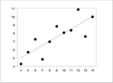
suggests the following:
- The data set "behaves like" a linear curve with some
scatter;
- there is no justification for a more complicated model
(e.g., quadratic);
- there are no outliers;
- the vertical spread of the data appears to be of
equal height irrespective of the X-value; this
indicates that the data are equally-precise throughout and
so a "regular" (that is, equi-weighted) fit is
appropriate.
|
|
Three Additional Data Sets
|
This kind of characterization for the data serves as
the core for getting insight/feel for the data. Such
insight/feel does not come from the quantitative statistics;
on the contrary, calculations of quantitative statistics such as
intercept and slope should be subsequent to the
characterization and will make sense only if the
characterization is true. To illustrate the loss of
information that results when the graphics insight step is
skipped, consider the following three data sets
[Anscombe data
sets 2, 3, and 4]:
 X2     Y2       X3     Y3       X4     Y4
10.00   9.14    10.00   7.46     8.00   6.58
 8.00   8.14     8.00   6.77     8.00   5.76
13.00   8.74    13.00  12.74     8.00   7.71
 9.00   8.77     9.00   7.11     8.00   8.84
11.00   9.26    11.00   7.81     8.00   8.47
14.00   8.10    14.00   8.84     8.00   7.04
 6.00   6.13     6.00   6.08     8.00   5.25
 4.00   3.10     4.00   5.39    19.00  12.50
12.00   9.13    12.00   8.15     8.00   5.56
 7.00   7.26     7.00   6.42     8.00   7.91
 5.00   4.74     5.00   5.73     8.00   6.89
|
|
Quantitative Statistics for Data Set 2
|
A quantitative analysis on data set 2 yields
N = 11
Mean of X = 9.0
Mean of Y = 7.5
Intercept = 3
Slope = 0.5
Residual standard deviation = 1.237
Correlation = 0.816
which is identical to the analysis for data set 1. One might
naively assume that the two data sets are "equivalent" since that
is what the statistics tell us; but what do the statistics not tell
us?
|
|
Quantitative Statistics for Data Sets 3 and 4
|
Remarkably, a quantitative analysis on data sets 3 and 4 also yields
N = 11
Mean of X = 9.0
Mean of Y = 7.5
Intercept = 3
Slope = 0.5
Residual standard deviation = 1.236
Correlation = 0.816 (0.817 for data set 4)
which implies that in some quantitative sense, all four of the
data sets are "equivalent". In fact, the four data sets are
far from "equivalent" and a scatter plot of each data set, which
would be step 1 of any EDA approach, would tell us that immediately.
|
|
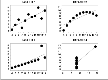
Scatter Plots
|
|
|
Interpretation of Scatter Plots
|
Conclusions from the scatter plots are:
- data set 1 is clearly linear with some scatter.
- data set 2 is clearly quadratic.
- data set 3 clearly has an outlier.
- data set 4 is obviously the victim of a poor experimental
design with a single point far removed from the bulk of
the data "wagging the dog".
|
|
Importance of Exploratory Analysis
|
These points are exactly the substance that provide
and define "insight" and "feel" for a data set. They are the
goals and the fruits of an open exploratory data analysis
(EDA) approach to the data. Quantitative statistics are not wrong
per se, but they are incomplete. They are incomplete because they
are numeric summaries which in the summarization
operation do a good job of focusing on a particular aspect
of the data (e.g., location, intercept, slope, degree of
relatedness, etc.) by judiciously reducing the data to a few
numbers. Doing so also filters the data, necessarily
omitting and screening out other sometimes crucial information in
the focusing operation. Quantitative statistics focus but also
filter; and filtering is exactly what makes the quantitative
approach incomplete at best and misleading at worst.
The estimated intercepts (= 3) and slopes (= 0.5) for data sets 2, 3,
and 4 are misleading because the estimation is done in
the context of an assumed linear model and that
linearity assumption is the fatal flaw in this analysis.
|
|
|
The EDA approach of deliberately postponing the
model selection until further along in the analysis has many
rewards, not the least of which is the ultimate convergence
to a much-improved model and the formulation of valid
and supportable scientific and engineering conclusions.
|

