
|
|
BLAND ALTMAN PLOTName:
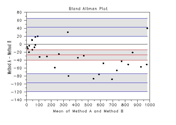
That is, it plots the difference of the variables against their means. Often Y and X will represent two different measurement methods. The Bland Altman plot is similar to the Tukey mean difference plot, but there are a few differences.
Several reference lines are added to the Bland Altman plot (these can be omitted from plot with appropriate settings for the LINE and CHARACTER commands). Specifically, the following curves are generated
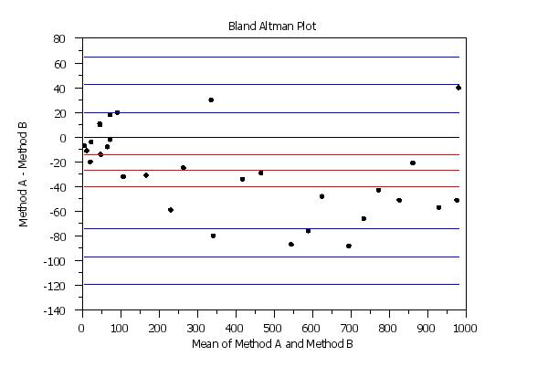
The reference line for the mean of the differences gives an indication of the bias between the two methods. If the bias is relatively consistent across the horizontal axis, the methods may be calibrated by simply subtracting (or adding) this value. If there is a trend as the mean values increase, then a linear, quadratic or some other more involved calibration may be required. The limits of agreement can be used to asses whether the differences between the two methods are practically significant. If the differences are approximately normally distributed, then approximately 95% of the differences should be within these limits. If the limits of agreement are deemed clinically insignficant, then the two measurement methods may be considered equivalent for practical purposes. However, particularly for small samples, these limits of agreement may not be reliable. So the confidence limits for these can help give an indication of the uncertainty in these limits. These confidence limits are only approximate, but they should be adequate for most purposes. The LINE and CHARACTER commands can be used to control the appearance of the plot. This is demonstrated in the Program examples below. Setting particular LINE or CHARACTER settings to BLANK can be used to omit some of the reference lines. Typically, the reference lines for the mean difference and the lower and upper limits of agreement will be included. However, you have control over all of them.
<SUBSET/EXCEPT/FOR qualification> where <y1> is the first response variable; <y2> is the second response variable; and where the <SUBSET/EXCEPT/FOR qualification> is optional. This syntax assumes that the response variables contain the summary location statistic (typically the mean) for each group and that the groups are properly paired between the two response variables.
<SUBSET/EXCEPT/FOR qualification> where <y1> is the first response variable; <y2> is the second response variable; <tag> is a group-id variable that defines the highlighting; and where the <SUBSET/EXCEPT/FOR qualification> is optional. This syntax assumes that the response variables contain the summary location statistic (typically the mean) for each group and that the groups are properly paired between the two response variables. Both response variables and the highlight variable must have the same number of rows. This syntax can be used to plot different plot points with different attributes. For example, it can be used to highlight groups in the data or to highlight points that indicate where the two methods are clinically different. It can also be used to label the plot points with the laboratory id.
You need to account for the number of groups in the
<SUBSET/EXCEPT/FOR qualification> where <y1> is the first response variable; <x1> is the group-id variable corresponding to the first response variable; <y2> is the second response variable; <x2> is the group-id variable corresponding to the second response variable; and where the <SUBSET/EXCEPT/FOR qualification> is optional. This syntax is used for the case where you have raw data. The <y1> and <x1> variables should have the same number of elements and the <y2> and <x2> variables should have the same length. However, <y1> and <y2> are not required to have the same length. Note that group-id variables should have the same group-id's. They do not need to be in the same order, but the distinct elements of <x1> and <x2> should be the same. Highlighting (Syntax 2) is not supported for the raw data case.
BLAND ALTMAN PLOT Y1 Y2 SUBSET TAG > 2 HIGHLIGHT BLAND ALTMAN PLOT Y1 Y2 TAG
These parameters can be used to label certain features of the plot.
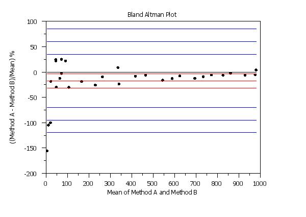
To plot percentage differences, enter
To reset the default, enter
If percentage differences were requested, these will be written to column one rather than the raw differences. This can be useful for the following purposes.
For example, you can do something like the following
    SKIP 0
    READ dpst1f.dat YDIFF YAVE
    .
    NORMAL PROBABILITY PLOT YAVE
    NORMAL ANDERSON DARLING GOODNESS OF FIT YAVE
    .
    FIT YDIFF YAVE
Note:
To reset the default of means, enter
To reset the default intervals, enter
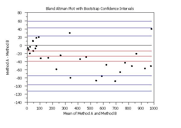
Note that it is the differences between the two sets of data that are bootstrapped, not the original response variables. It is recommended that you have at least 20 differences before using the bootstrap based confidence intervals. The mean of the difference of the means, and the limit of agreement lines (\( \bar{Y} \pm 2s \) with \( \bar{Y} \) and s denoting the mean and standard deviation of the original differences) are computed as before. These 3 values are then computed for each bootstrap sample and the 2.5 and 97.5 percentiles of these bootstrap samples are used for the confidence limits.
Bland and Altman (1983), "Measurement in Medicine: The Analysis of Method Comparison Studies", Statistician, Vol. 32, pp. 307-317.
. Step 1: Read the data
.
skip 25
read bland.dat y1 y2
skip 0
.
. Step 2: Set plot control features
.
case asis
title case asis
label case asis
title offset 2
y1label Method A - Method B
x1label Mean of Method A and Method B
title Bland Altman Plot
.
line blank solid solid dash dash solid dash dash solid dash dash
line color black black red red red blue blue blue blue blue blue
character circle
character hw 1.0 0.75
character fill on
.
ylimits -140 80
.
. Step 3: Generate the plot
.
bland altman plot y1 y2
.
. Step 4: Now generate the plot with uncertainty regions shaded
.
subregion on on on
let xmin = minimum xplot subset tagplot = 1
let xmax = maximum xplot subset tagplot = 1
subregion 1 xlimit xmin xmax
subregion 2 xlimit xmin xmax
subregion 3 xlimit xmin xmax
subregion 1 ylimit diffmlcl diffmucl
subregion 2 ylimit lowlmlcl lowlmucl
subregion 3 ylimit upplmlcl upplmucl
region fill on on on
region color g90 g90 g90
region border line bl bl bl
.
bland altman plot y1 y2
subregion off off off
region fill off off off
.
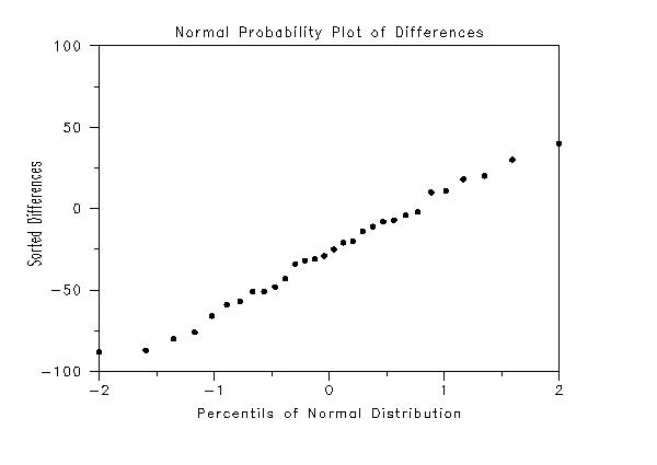
. Step 5: Generate probability plot of the diffferences
.
skip 0
read dpst1f.dat ydiff
y1label Sorted Differences
x1label Percentils of Normal Distribution
Title Normal Probability Plot of Differences
ylimits
normal probability plot ydiff
. Step 1:   Read the data
.
skip 25
read bland.dat y1 y2
skip 0
.
. Step 2:   Set plot control features
.
case asis
title case asis
label case asis
title offset 2
y1label ((Method A - Method B)/Mean) %
x1label Mean of Method A and Method B
title Bland Altman Plot
.
line blank solid solid dash dash solid dash dash solid dash dash
line color black black red red red blue blue blue blue blue blue
character circle
character hw 1.0 0.75
character fill on
.
. Step 3:   Generate the plot
.
set bland altman plot percentage
bland altman plot y1 y2
 Program 3:
. Step 1:   Read the data
.
skip 25
read bland.dat y1 y2
skip 0
let n = size y1
let tag = 1 for i = 1 1 n
let ydiff = y1 - y2
let tag = 2 subset ydiff < -80
let tag = 3 subset ydiff >  35
.
. Step 2:   Set plot control features
.
case asis
title case asis
label case asis
title offset 2
y1label Method A - Method B
x1label Mean of Method A and Method B
title Bland Altman Plot
.
line       blank blank blank solid solid blank blank solid blank blank ...
           solid blank blank
line color black black black black red   red   red   blue  blue  blue  ...
           blue  blue  blue
character circle circle circle
character hw 2.0 1.50 all
character fill on on on
character color black red blue
.
. Step 3:   Generate the plot
.
ylimits -140 80
highlight bland altman plot y1 y2 tag
 Program 4:
. Step 1:   Read the data
.
skip 25
read bland.dat y1 y2
skip 0
.
. Step 2:   Set plot control features
.
case asis
title case asis
label case asis
title offset 2
y1label Method A - Method B
x1label Mean of Method A and Method B
title Bland Altman Plot with Bootstrap Confidence Intervals
.
line blank solid solid dash dash solid dash dash solid dash dash
line color black black red red red blue blue blue blue blue blue
character circle
character hw 1.0 0.75
character fill on
.
ylimits -140 80
.
. Step 3:   Generate the plot
.
bootstrap samples 10000
seed 31298
set random number generator fibbonacci congruential
set bland altman plot confidence intervals bootstrap
.
bland altman plot y1 y2
Date created: 07/19/2017 |
Last updated: 12/04/2023 Please email comments on this WWW page to alan.heckert@nist.gov. | ||||||||||||||||||||||||||||||||||||||||||||||||||||||||||||||||||||||||||||||||||||||||||||||||||||||||||||
 Program 2: