|
|
ROSE PLOTName:
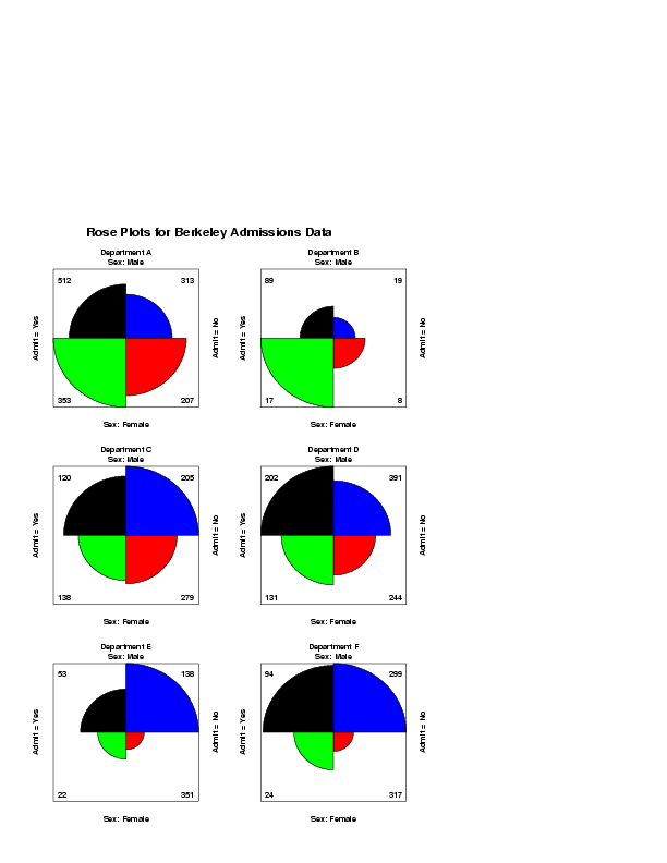
According to Wainer (1997), the use of a common angle is the strength of the rose plot since it allows us to easily compare a sequence of rose plots (i.e., the corresponding segments in different rose plots are always in the same relative position). In particular, this makes rose plots an effective technique for displaying the data in contingency tables. Friendly (2000) refers to the special case of 2x2 tables as the fourfold plot. As with the general case, an effective use of these plots is when we have a sequence of related 2x2 tables. Using the MULTIPLOT command, Dataplot can easily generate the sequence of rose plots or fourfold plots on a single page. As an interesting historical note, Wainer points out that rose plots were used by Florence Nightingale (she referred to them as coxcombs).
where <x> is the variable containing counts; and where the <SUBSET/EXCEPT/FOR qualification> is optional. Use this syntax when you have a single variable of counts (or proportions).
where <y1> is the first response variable; <y2> is the second response variable; and where the <SUBSET/EXCEPT/FOR qualification> is optional. With this syntax, the <y1> and <y2> variables are cross-tabulated to generate a 2x2 table. The rose plot is then generated from this 2x2 table.
ROSE PLOT X SUBSET TAG > 2 ROSE PLOT Y1 Y2
Friendly (2000), Visualizing Categorical Data SAS Institute Inc., p. 90.
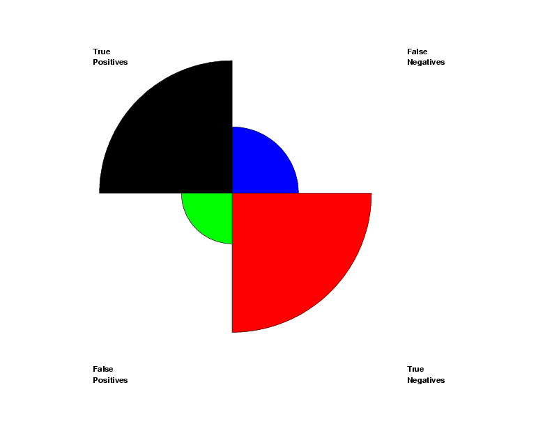
let y = data 48 12 53 7
.
region fill on on on on
region fill color black blue red green
rose plot y
.
case asis
justification left
move 15 90
text Truecr()Positives
move 15 10
text Falsecr()Positives
move 75 90
text Falsecr()Negatives
move 75 10
text Truecr()Negatives
Program 2:
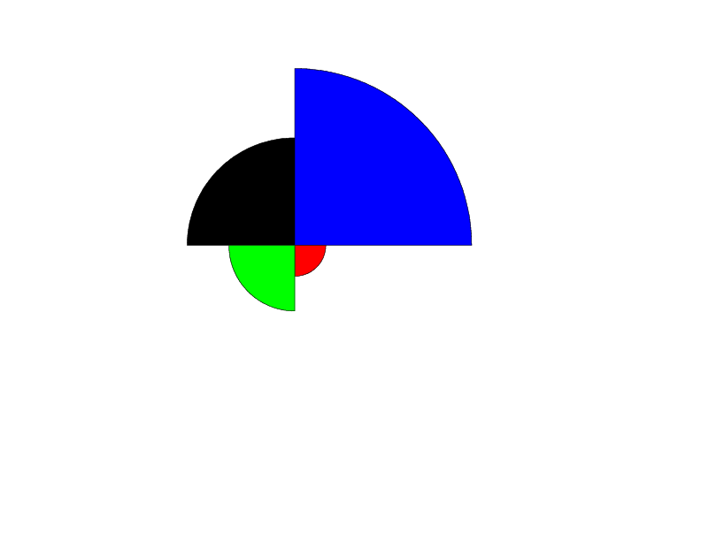
let n = 1
let x = sequence 1 100 1 5
.
let p = 0.8
let y1 = binomial rand numb for i = 1 1 100
let p = 0.92
let y2 = binomial rand numb for i = 1 1 100
.
let p = 0.6
let y1 = binomial rand numb for i = 101 1 200
let p = 0.95
let y2 = binomial rand numb for i = 101 1 200
.
let p = 0.96
let y1 = binomial rand numb for i = 201 1 300
let p = 0.98
let y2 = binomial rand numb for i = 201 1 300
.
let p = 0.3
let y1 = binomial rand numb for i = 301 1 400
let p = 0.2
let y2 = binomial rand numb for i = 301 1 400
.
let p = 0.9
let y1 = binomial rand numb for i = 401 1 500
let p = 0.2
let y2 = binomial rand numb for i = 401 1 500
.
region fill on on on on
region color black blue red green
rose plot y1 y2 subset x = 5
.
set conditioning plot type two variable rose
region fill off on on on on
region color white black blue red green
condition plot y1 y2 x
Program 3:
orientation square
.
.  Berkeley Admissions Data from p. 391 of
.  Friendly (2000), "Visualizing Categorical Data",
.  SAS Institute Inc.
.
read y1 y2 x
512 313 1
353 207 1
 89  19 2
 17   8 2
120 205 3
138 279 3
202 391 4
131 244 4
 53 138 5
 22 351 5
 94 299 6
 24 317 6
end of data
.
multiplot corner coordinates 0 0 100 95
multiplot scale factor 2
multiplot 3 3
.
legend case asis
legend justification left
legend 2 justification right
legend 4 justification right
legend 1 coordinates 17 83
legend 2 coordinates 83 83
legend 3 coordinates 17 22
legend 4 coordinates 83 22
.
region fill on on on on
region fill color black blue red green
box shadow hw 0 0
.
label case asis
title case asis
y1label Admit = Yes
y2label Admit = No
x1label Sex: Female
x2label Sex: Male
x2label displacement -74
.
let string t1 = Department A
let string t2 = Department B
let string t3 = Department C
let string t4 = Department D
let string t5 = Department E
let string t6 = Department F
.
let icnt = 0
let icnt2 =0
loop for k = 1 1 6
   let icnt = icnt+1
   let atemp = y1(icnt)
   legend 1 ^atemp
   let atemp = y2(icnt)
   legend 2 ^atemp
   let icnt = icnt+1
   let atemp = y1(icnt)
   legend 3 ^atemp
   let atemp = y2(icnt)
   legend 4 ^atemp
   title ^t^k
   let icnt2 = icnt2 + 1
   if k = 3
      let icnt2 = icnt2 + 1
   end of if
   if k = 5
      let icnt2 = icnt2 + 1
   end of if
   multiplot 3 3 icnt2
   rose plot y1 y2 subset x = k
   box 15 20 85 90
end of loop
.
end of multiplot
.
case asis
justification center
move 30 97
text Rose Plots for Berkeley Admissions Data
| |||||||||||||||||||||||||
|
Date created: 01/07/2008 Last updated: 12/04/2023 Please email comments on this WWW page to alan.heckert@nist.gov. |
|||||||||||||||||||||||||