|
|
|
|
Dataplot: Spikes
Introduction
|
Dataplot can draw a curve as a character or plot symbol at each
point, as a connected line, as a spike from the point to a base,
as a bar from the point to a base, or as any combination of the
above (including drawing none or all of them). The choice is
determined by the
LINE,
CHARACTER,
SPIKE, and
BAR commands. The switches
for these commands work independently of each other.
|
Description
|
A spike is a vertical line from the plot point to the spike base
(often the x axis, but it can be other values such as the
mean).
|
The spike is most often drawn as a solid line, but you can draw it using a dash or dot pattern as well. The available line patterns are the same as for drawing lines.
Some Common Usage
|
Spikes are commonly used in time series plots. They are also
useful in showing deviation from a common value such as the mean
or median. They are also used to draw dot charts, which are an
alternative to bar plots recommended by Bill Cleveland in the book
"Elements of Graphing Data".
|
Use of Short Forms
|
The short designations (e.g., BL for BLANK, SO for SOLID, DA3 for
DASH3) allow for the specification of a large number of spike types
on a single command line, as in
|
How Dataplot Decides Which Spike Pattern to Use
|
For single-trace plots, as from
|
For multi-trace plots, as from
PLOT Y X TAG
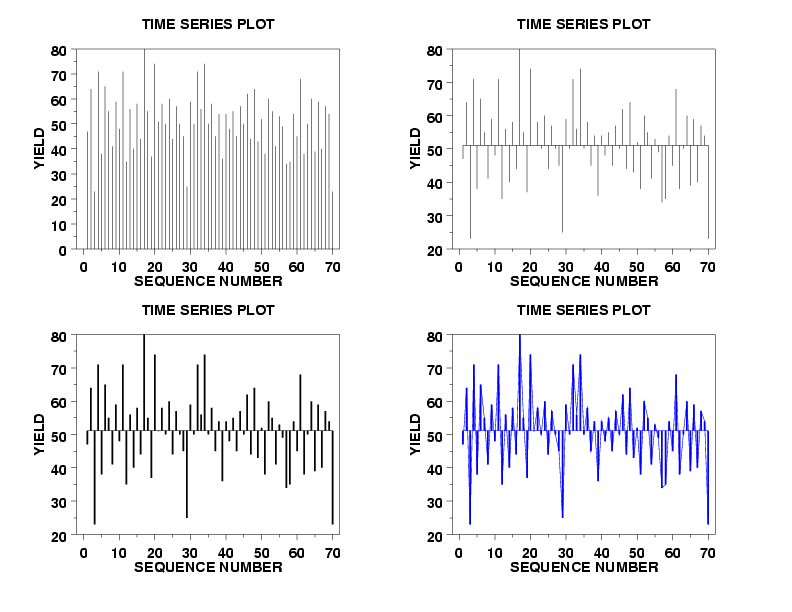
Dataplot Program Demonstrating the Attributes of Spikes
|
Dataplot allows you to set the base, line style, thickness, and
color of the spike as demonstrated by the following Dataplot
program.
|
READ BOXJE142.DAT YIELD . TITLE TIME SERIES PLOT Y1LABEL YIELD X1LABEL SEQUENCE NUMBER XLIMITS 0 70 XTIC OFFSET 2 2 LET N = SIZE YIELD LET A = MEAN YIELD CHARACTER OFF SPIKE ON LINE BLANK . MULTIPLOT 2 2 MULTIPLOT CORNER COORDINATES 0 0 100 100 PLOT YIELD . SPIKE BASE A PLOT YIELD LINE SOLID DRAWDATA 1 A N A LINE BLANK . SPIKE THICKNESS 0.3 PLOT YIELD LINE SOLID DRAWDATA 1 A N A LINE BLANK . SPIKE COLOR BLUE LINE SOLID LINE COLOR BLUE PLOT YIELD DRAWDATA 1 A N A END OF MULTIPLOT
Dataplot Graph
|
The above program generated the following Dataplot graph.
|
|
Privacy
Policy/Security Notice
NIST is an agency of the U.S.
Commerce Department.
Date created: 06/05/2001 | ||